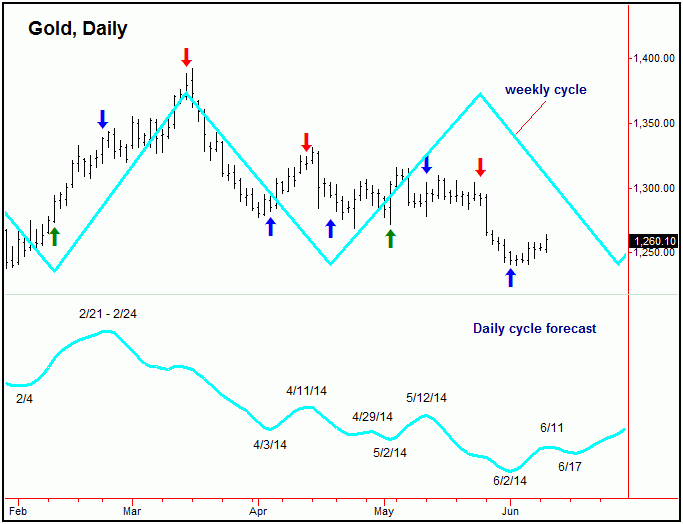
On the above chart, the most important periods are when both the daily and weekly forecast paths are moving in the same direction. The green arrows show when both forecasts are moving higher (i.e., a ‘buy’ signal with the model), and red arrows are when both models are forecasting lower prices (i.e., a ‘sell’ signal). A blue arrow is shown when the models are in disagreement (i.e., a ‘neutral’ signal).
With the above, we can see that when both forecast paths are in alignment, the market
tends to move strongly in that direction. I should add that, when the daily and weekly
forecasts disagree, that the market has more of a tendency to follow the shorter-
The chart below is the most important chart that I track, and is what I use to forecast
the near-

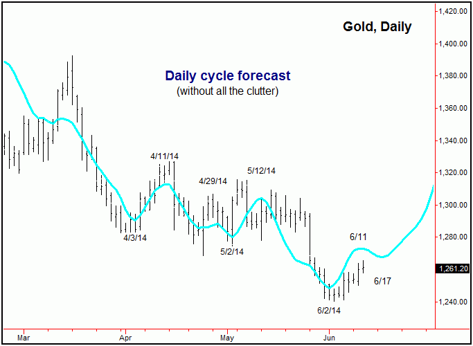
The above chart shows the daily cycle forecast, this time without all the clutter.
That is, in taking away all of the vertical lines and text (and also the weekly cycle)
and then overlaying the daily forecast over top of price action, we can see the model
is extremely accurate in calling the turns. Of course, there is never a guarantee
that the near-
You can see above that the forecasts from the daily and weekly cycles caught most of the major up and down swings seen so far in 2014. Going a bit further, when both paths have been in alignment in 2014, Gold has gained approximately 218 points, vs. only 52 points for the metal itself (as of 6/9/14). As a trader, I want to know when these cycles are moving in the same direction – and never want to be against the same. This daily/weekly forecast chart is what I use to make the forecasts shown in the Gold Wave Trader
market letter.
Click here for subscription information.